Rice Bowl
-
Rice Bowl, is an exquisite culinary destination nestled in the heart of Kansas City, where delectable flavors and a rich cultural experience await every guest.
This establishment is more than just a restaurant; it's a culinary journey that combines the artistry of Asian cuisine with the vibrant spirit of the Midwest.
The menu showcases a carefully curated selection of Asian-inspired dishes, featuring the finest ingredients and authentic recipes. From savory stir-fries to aromatic noodle bowls, and tantalizing sushi rolls to perfectly grilled meats, Rice Bowl offers a plethora of options to suit every palate and dietary preference.
-
By implementing this branding strategy, Rice Bowl in Kansas City will transform its image from a local fast-food restaurant to a reputable establishment offering exceptional, authentic Asian cuisine in a simple yet sophisticated and culturally enriched setting.
-
Rice Bowl in Kansas City caters to a diverse audience of individuals who appreciate authentic and delectable Asian cuisine, as well as a culturally enriching dining experience. Our target audience includes:
Food Enthusiasts,
Local Residents and Families,
Working Professionals,
Tourists and Travelers,
Couples and Date-Night Seekers,
Health-Conscious Diners,
Students and Young Adults
-
Name and Tagline:
Retain the name "Rice Bowl" to maintain brand recognition while subtly emphasizing its authenticity. Incorporate a tagline like "Authentic Asian Flavor" to clearly communicate the shift towards genuine Asian cuisine.
Mission Statement:
Focusing on delivering high-quality, authentic Asian food to Kansas City while embracing simplicity and excellence in every aspect of the dining experience.
Core Values:
Highlight core values such as authenticity, community, quality, and simplicity to align with the rebranding strategy.
-
Item deIconography:
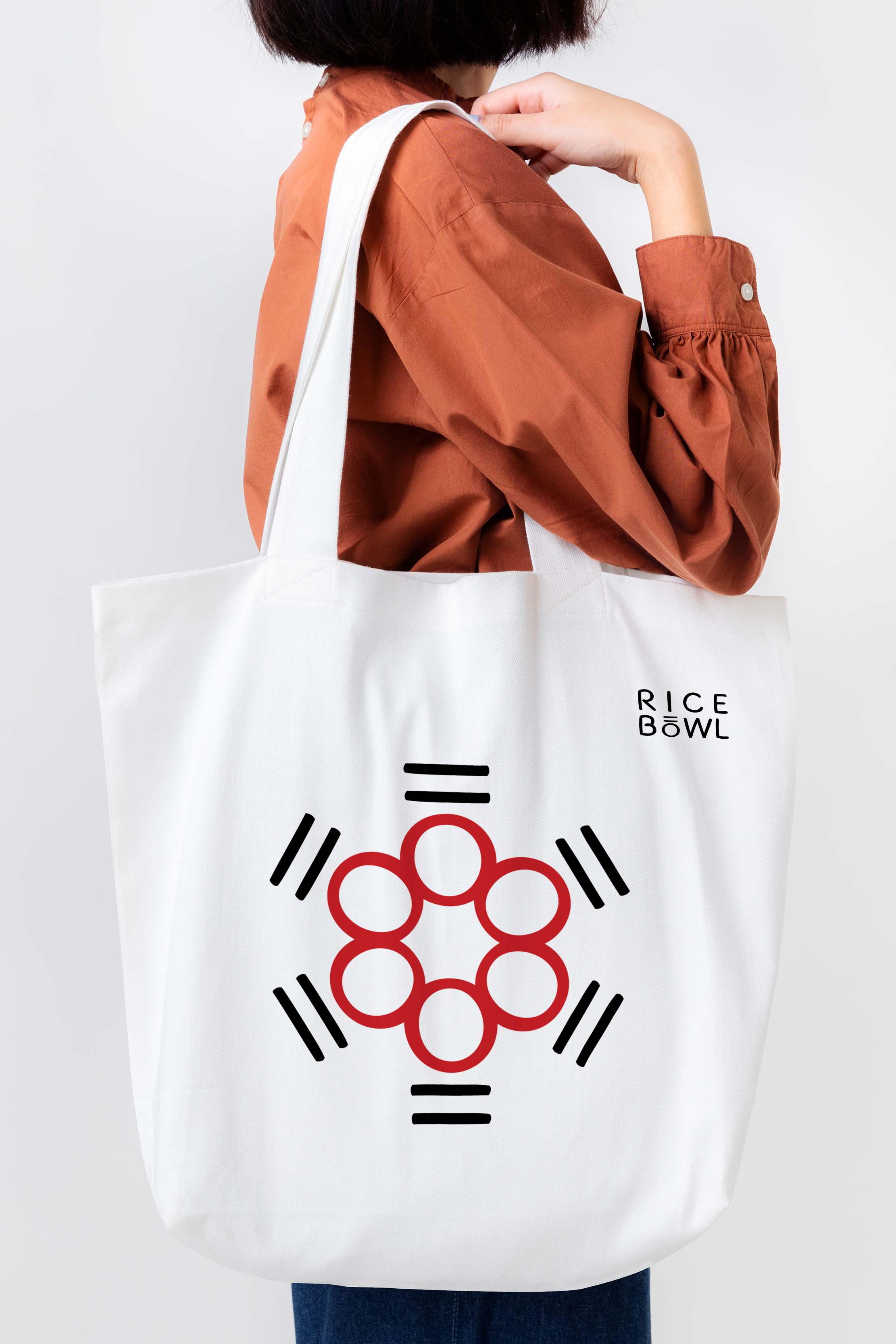
Create a minimalist, elegant logo with a stylized rice bowl icon that embodies simplicity and the heart of Asian cuisine. Incorporate chopsticks and bowls to enhance cultural representation.
Typography:
Use clean, modern typography with sleek lines and sharp edges to represent a contemporary feel. Opt for a sans-serif font for readability and a modern touch.
Color Scheme:
Utilize a predominantly black and red color scheme. Black represents sophistication and elegance, while red signifies energy, passion, and Asian culture. Strive for a balance that is visually striking and culturally authentic.
Layout:
Ensure the logo is adaptable and scalable, maintaining clarity and legibility across various platforms and sizes.
-
Layout:
Opt for a clean, minimalist layout that emphasizes the brand's new image and the focus on authentic Asian cuisine.
Utilize a clear grid system to organize the menu items, incorporating ample white space for a modern, uncluttered look.
Typography:
Use the chosen sans-serif font for a contemporary and easy-to-read menu.
Incorporate a combination of font weights and sizes to guide attention to key sections and dishes.
Imagery:
Include high-quality, appetizing images of signature dishes to entice diners and showcase the authenticity and quality of the food.
Color Usage:
Use the black and red color palette for headers, accents, and call-to-action elements to maintain brand consistency.
Balance the use of color to ensure readability and visual appeal.


